UX/Design for Customer Service Order Entry System
Really Good Stuff decided to move their order entry system to one that was provided by their ecommerce platform vendor. However, the default system did not meet the needs of customer service and the user experience was difficult and confusing. I was tasked with creating a solution to resolve these issues.
I began by researching the current needs and wants of the customer service team and gained an understanding of their order process. I then reviewed the order entry system, quickly realizing there were significant issues with the page layouts, and overall, the system was lacking UI design. I began by creating wireframes thoroughly working through organizing and clarifying information before moving on to mock ups, adding design and color.
CLIENT:
Really Good Stuff, a provider of high-quality teaching and classroom supplies
SKILLS:
User Experience
Info Architecture
Wireframing
Design
Page Layout
SOFTWARE:
Photoshop
Illustrator
Page Layout
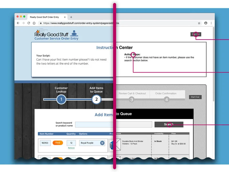
I established a page layout that is consistent throughout the ordering process. The page is broken up into three key segments. At the top is the instruction center containing tips and reminders for the representative. Below are areas for the progress indicator bar and the ordering process inclusive of data, fields, and forms.
There were several changes made to the progress indicator bar making it more useful and intuitive. Descriptive labels were added above each step. The link that would abort an order and bring the user back to step one was relocated to this area. To avoid a potential misunderstanding with quitting out of the program, the text, “Quit Order,” was changed to “Cancel Order.” The link is hidden on the first and last steps since it’s not needed. In it’s place on the final confirmation step, a large “Begin Order” button appears.
Customer Look Up
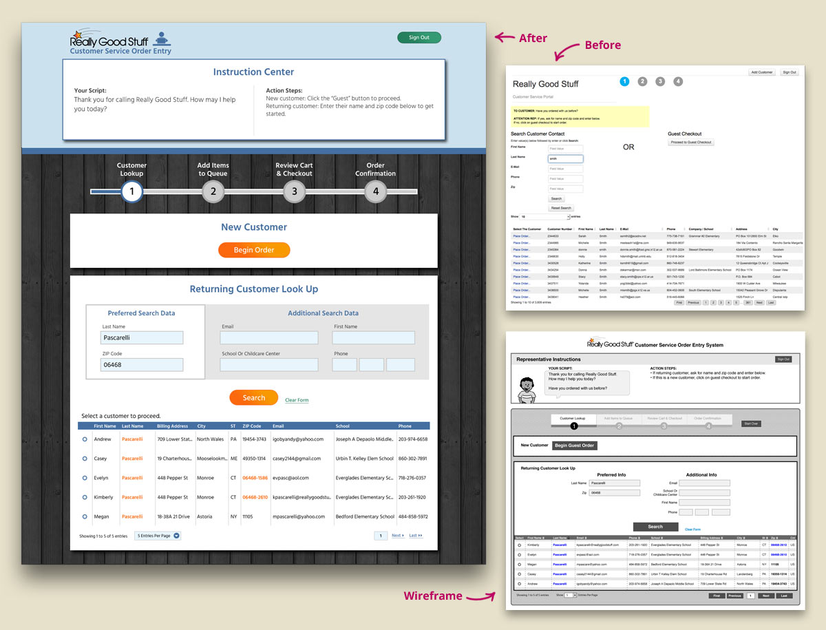
For the form in Step 1, I focused on improving the page layout and clarifying text to be more accurately descriptive. For example, the link to continue placing a new customer’s order read “Guest Checkout.” This potentially gives the impression the user will be taken to the checkout page so to be more accurate, the text was changed to “Begin Order.”
A few other key improvements included visually highlighting the two preferred data fields when looking up a returning customer; replacing the redundant “Place Order” text link with radial buttons to select a customer from the database; and highlighting text that was an exact match to the data entered in the fields in orange.
Search for Products
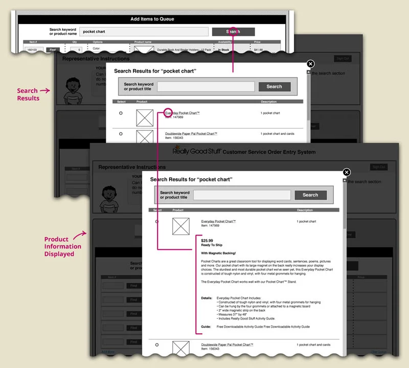
The search results opened in a lightbox window where I replaced redundant “Select” buttons with radial buttons; added the data field for the product’s short description to help the user differentiate similar products; and made the product name a clickable item which would expand the area below to display more detailed product information.
Previously to add a product to the queue from search, the user would have to click a button to select a product, fill out the input fields in the lightbox window and then click an “Add to Cart” button. I substantially simplified the user flow by allowing the user to select a radial button that would then add the product to the queue where the input fields could be filled out.
Add Items To Queue
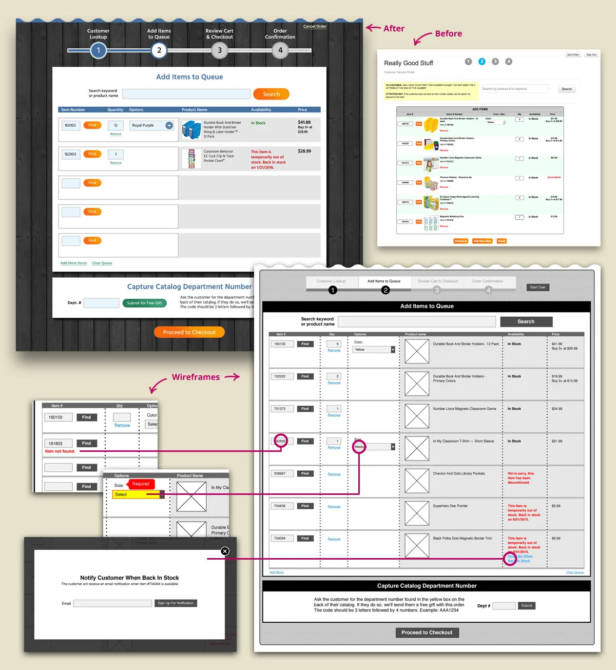
In addition to improving the text on this page, I cleaned up the product table by moving all the elements that potentially required input data from the user to the left-hand side of the form. With this layout, it was easy for users to quickly scan for empty fields. I also relocated the “Remove” link below the quantity field, as this is where it’s commonly found.
During one of my discussions with customer service, we decided it would be beneficial to access the real-time ERP system, which would provide more detailed availability messaging. This would allow representatives to offer customers the option to be notified when an item was back in stock by clicking a link and filling out a lightbox window. Another benefit from our discussions was the idea to move the field for capturing the customer’s catalog department number. Originally this field was located on the checkout page, but after thinking through the process, we realized it was more likely for the customer to have their catalog in hand at this time. This small changed created more a more efficient process.


